Project 06: City of Chicago Identity Proposal
Describing a city like Chicago in its entirety is almost impossible. Its architectural, cultural, and industrial history is so complex that perhaps the most fitting word is “storied.”
My “City of Chicago Identity Proposal” is the culmination of a semester-long research and design project completed during my time at the School of the Art Institute of Chicago. The final design included the “Rise” mark, a Helvetica type system, and a scalable grid system.
Defining Chicago
I approached this part of the project from two angles. The first angle being what Chicago is known for: deep-dish pizza, Chicago hot dogs, and the Cubs. The second angle being the reasons why I personally love the city. I moved to Chicago for school and quickly fell in love. It was so alluring—the culture, the busy energy, the endless list of places to explore. Once I selected the words that I felt encompassed the sentiments of both angles, I created a word map and wrote a poem about how the city made me feel. My musings and sketchings are outlined below.
Visual Research and Sketches
"Architecture" and "rise" started to define my research, and those themes continue in the final mark and application of the system.
The Mark
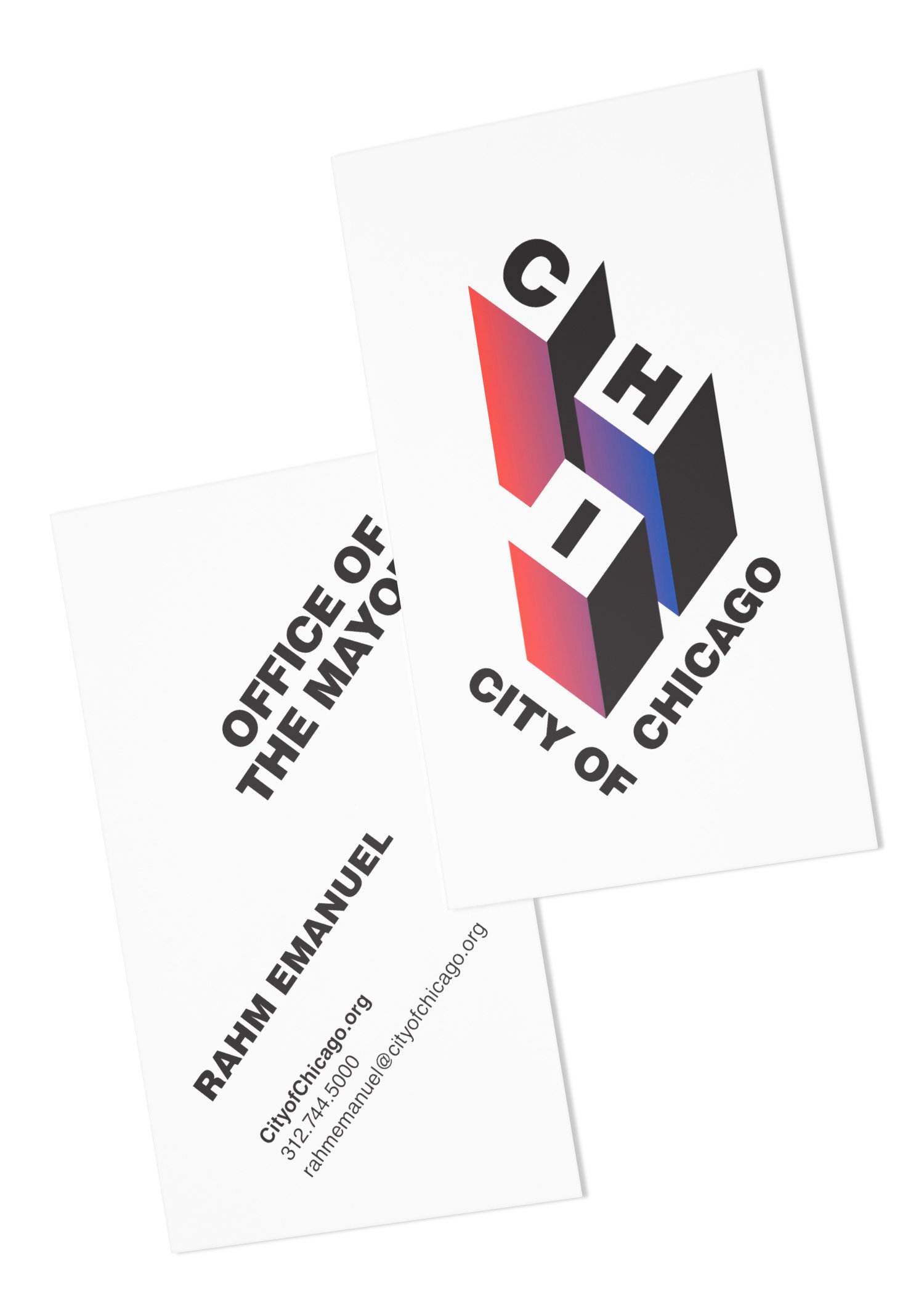
Meet the "Rise" mark. Chicago has some of the best architecture, food, and museums in the world. Its cultural heritage truly outshines all its contenders. The mark uses a red-to-blue gradient and all-capital Helvetica LT Std Black. Red is the color of fire and blood—it symbolizes energy, danger, strength, power, determination, passion, and love. Blue symbolizes trust, dignity, intelligence, and authority. Blue also happens to be the color of Lake Michigan. Together, these two colors represent a large spectrum of Chicago. The gradient further reflects this.

“Make no little plans…Make big plans; aim high in hope and work…”
— Daniel Burnham
Additional Marks, Typography, Grids, and the "Building Pattern"
The “Rise” mark is included in the system as black and white, grayscale, and full color. The "Compact" mark is in black and white and color, and the logotype in black.
Helvetica is often considered a corporate typeface because many companies use it in their logos. Jeep, Target, Crate&Barrel, and Panasonic are some of the most well known. Many regard this ubiquity as a negative thing, but I think choosing Helvetica as the official typeface of Chicago perfectly reflects the city’s deep historical roots of expanding trends and thriving industry sectors like auto manufacturing and biotechnology, etc.
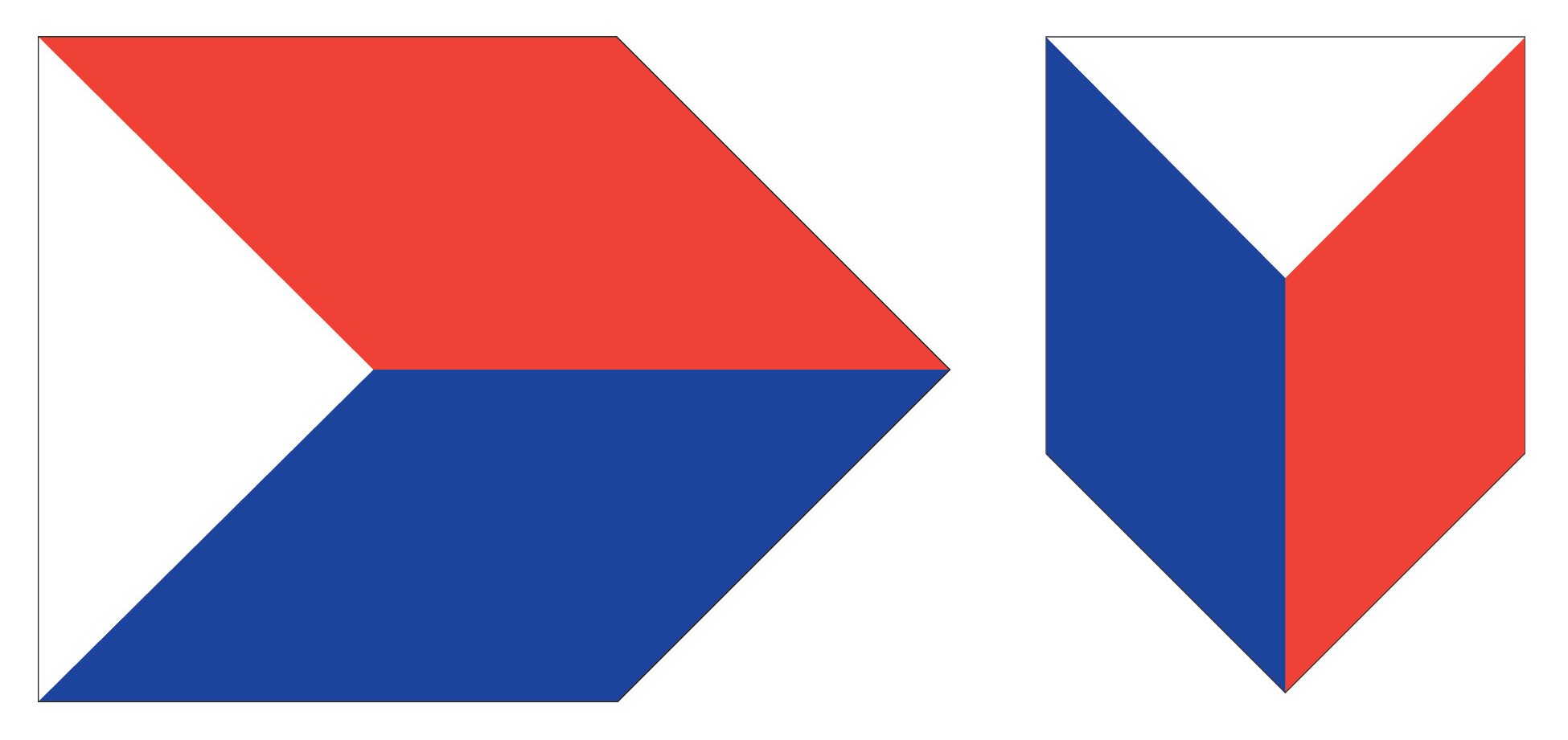
A grid system called the “Building Pattern” was developed to accommodate the large number of varying applications that will be necessary to fully implement the identity system on a city-wide scale. The system starts with a 1 inch square grid and can be scaled up with integers as necessary. To scale it down, the 1 inch grid is reduced by .25 inches as necessary.
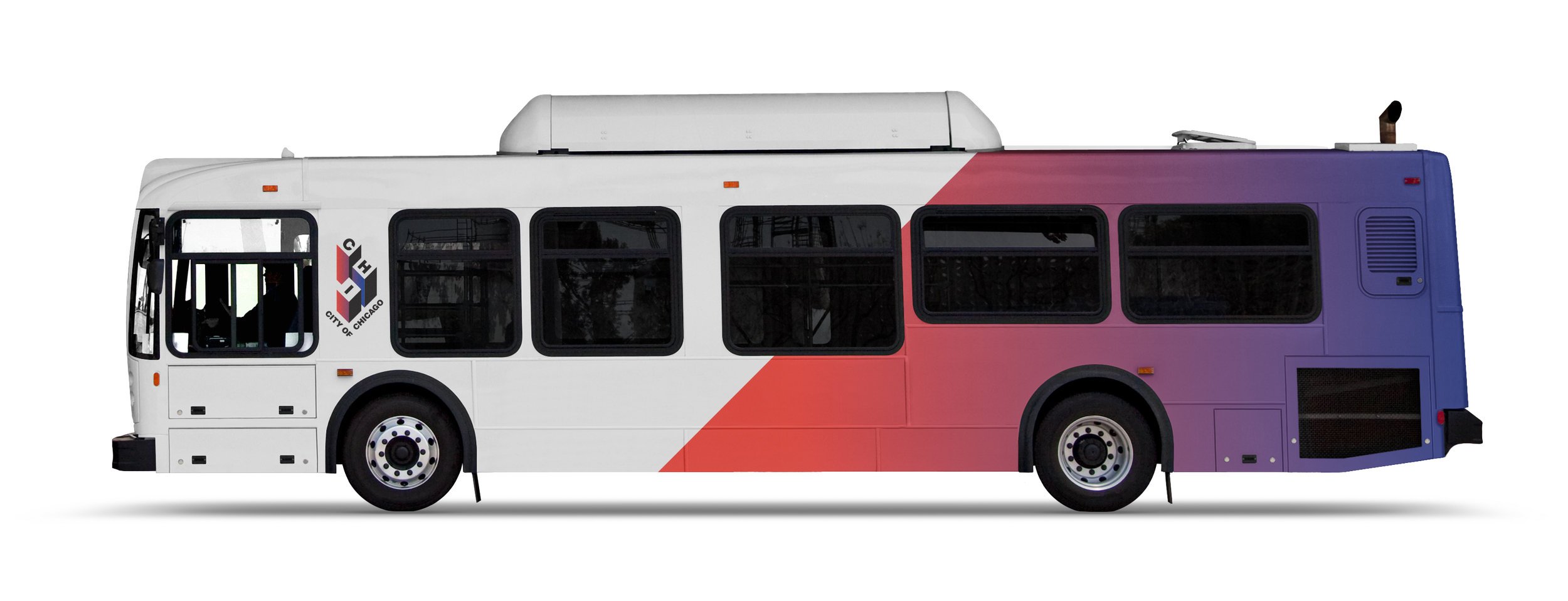
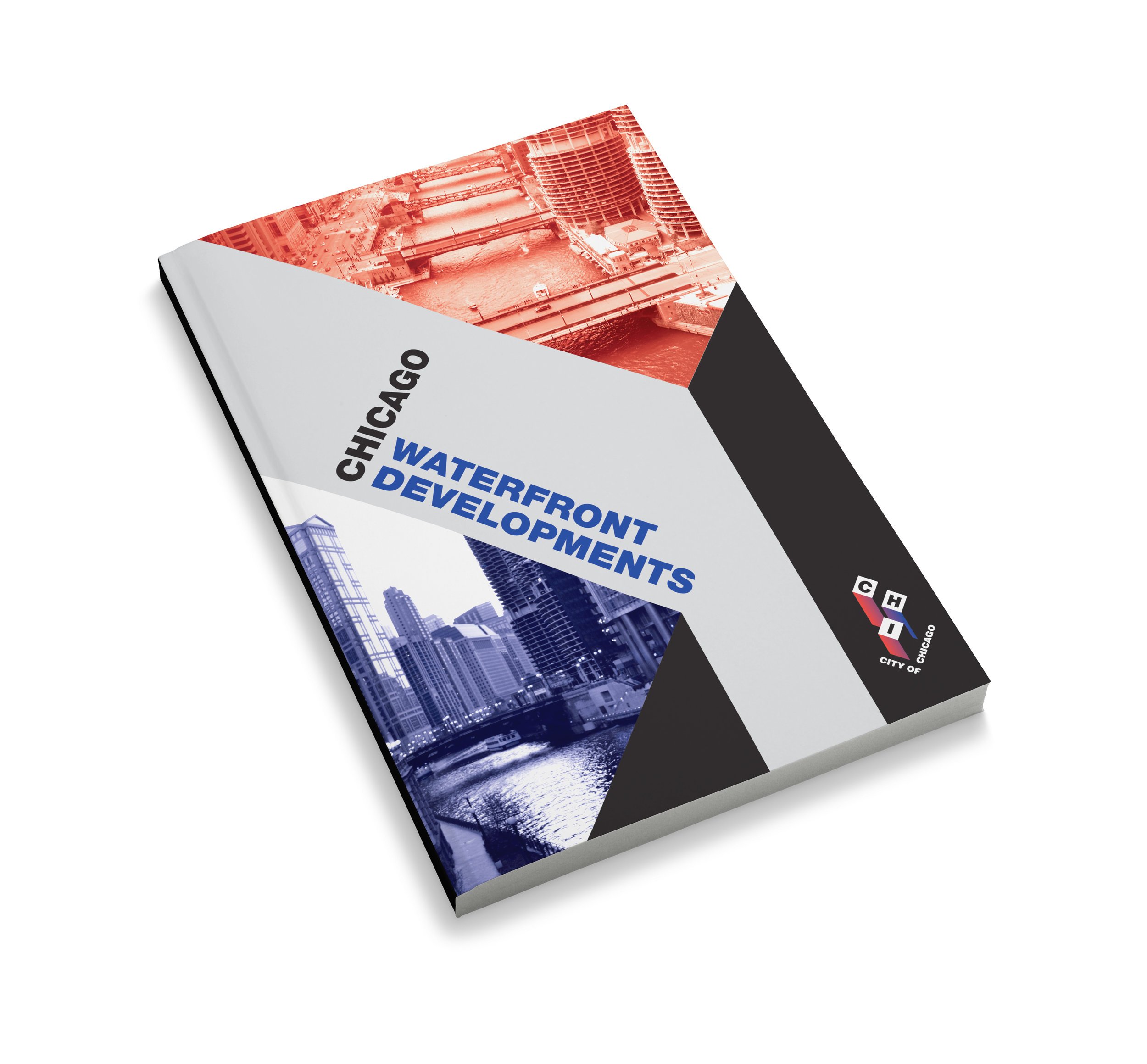
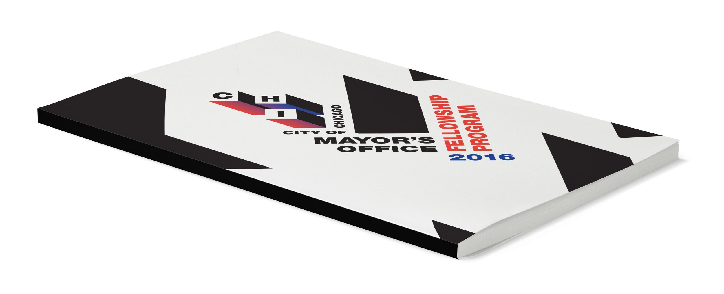
The "Building Pattern" can be used to create dynamic compositions that can serve as the basis of posters or postcards when photos are not readily available or are unnecessary. It was built from the "Rise" mark, though it is dramatically expanded and now creates a repeating pattern. The application of the pattern can be seen in several examples in the gallery below.
MEDIUM
Print and Digital
YEAR
2016
TYPE OF WORK
Student Work


